Monday, April 15, 2013

"Mail Art Month"


Mail Art by Alton DuLaney. April 2013.

April is National Letter Writing Month, or as I prefer to call it, Mail Art Month. It is one of the many times during the year that I try to inspire others to write more letters and send more things via the poste, instead of just 'posting' something on-line. Yes, in this day of instant messaging, texting, and blow-by-blow FaceBook updates, there is still something to be said for the hand-written letter. A hand-written love letter is often a cherished and preserved keepsake. A text message with a smiley face - not so much. :(

Letter writing is a great way to reconnect with an old friend, express your love for a romantic interest, and keep in touch with acquaintances around the world. It takes just a few minutes to write, and costs just a few cents to send, and for the recipient it is almost like getting a gift in the mail, gift wrap (the envelope) and all.  But as well as expressing oneself in what one writes within the letter, there is the blank canvas of the envelope to be personalized, customized, and artistically expressed. Thus the creation of "Mail Art".

"Mail Box" by Alton DuLaney, April 2013.
The first thing to do to ensure success in any crafting endeavor is to gather all the materials. Being something of an organization aficionado, I like to group things. Here is a great tip for keeping all your letter writing materials together. 

Create a "Mail Box", a designated box to hold all your cards, envelopes, scraps of deco paper and other stationery items. I covered mine in a sheet of deco paper which features vintage post cards. Just one glance into my crafting studio shelves, and my box of stationery is readily identifiable. When I am ready to send some mail, I just reach for my "Mail Box".

"Post Office Box" by Alton DuLaney, April 2013.
On a similar note, I also am something of an amature stamp collector. Every time I am at the Post Office, I buy extra stamps of various denominations. Back in the studio, I toss them all in a re-purposed cigar box, which I have covered with washi tape in canceled post mark print. I like to call it my "Post Office Box". Then when it is time to send a letter, I spread out my stamps and choose the one (or ones) that best match the mail art, the mood, or the recipient. (I also have a friend who is a proper philatelist - stamp collector - who occasionally sends me some of his extra vintage stamps, which adds to the variety!) Keep in mind that there is more than one way to arrive at the proper postage to send a letter: you can use 1 44cent stamp or 44 1cent stamps. By varying the postage used, one adds to the artistic statement of the Mail Art. Also note that stamps of all denominations can be purchased on-line, saving you a trip to the post office and a wait in a long line.

Now what is all this talk of Mail Art and how can a person go about turning a letter into a work of art? Simply put, Mail Art is transforming a basic card or letter into art by customizing it and embellishing it with some form of creative expression.  Allow me to share a few simple things anyone can do to become a Mail Artists.

Envelope Liners by Alton DuLaney April 2013.

A quick and easy trick that can dress up any envelope is the envelope liner. You simply trace the shape of the open envelope onto the paper of your choice, trim with scissors, insert and secure with adhesive. When the recipient opens the envelope there is the added surprise of elegance, texture and color of the liner.

Liners for Store-bought cards by Alton DuLaney April 2013.
The envelope liner can be used on bank note cards or stationery, or as a way to dress up cards bought off the shelf. It is just one way to add a little something special to the letter sending process.
Wallpaper Envelope Liners by Alton DuLaney April 2013.
A variety of materials can be used to create the envelope liner. Above, I used wallpaper swatches to line envelopes with corresponding note cards. I have matched the patterns, creating customized sets.

Map Envelope Liners by Alton DuLaney April 2013.
For a more masculine touch, consider using readily available materials such as graph paper, air mail paper or old maps. Maps are especially clever when sending letters from abroad. Ex: When visiting NYC, use a subway map to make an envelope liner and send it to your friends back at home. It makes a great travel letter! A souvenir postcard can even be purchased and placed inside, heightening the experience.

Doily Envelope Liners by Alton DuLaney April 2013.
Another great trick I love to do it using a paper doily as an envelope liner. Packages of plain white doilies can be purchased at cooking supply stores or craft stores or colorful ones can be employed for holiday sentiment. A beautiful red foil doily used as an envelope liner really dresses up any Valentine's Day card. These are also great for weddings, showers, Mother's Day, etc.
Note Card Sets by Alton DuLaney April 2013.
Taking it all one step further, a design element from the deco paper can be isolated, cut out, and adhered to the note card and front of envelope, in addition to the liner, to make an overall creative and customized statement. Within a few minutes, a plain note card and envelope has been transformed into Mail Art!

Mail Art by Alton DuLaney April 2013.
Once the basic concepts of embellishing stationery have been grasped, there is no limit to where the basic letter can be transformed into Mail Art, or where it can be sent, with proper postage of course.

Above, I have used decorative tape from the Scotch Expressions line to create various Mail Art Masterpieces. On some, I use the stamp as the inspiration and decorate the envelope to match. On others I experiment with mixing decorative Washi tape with rubber stamping. I've used masking tape for solid coverage. (Masking, Washi and Magic tape can all be easily written on with permanent ink, making them easy to address.) In other cases I use Printed Packaging tape for a slick, glossy, coverage.(If Printed Packaging tape can dress up a box or parcel, imagine what it can do for the simple envelope!) Again, the only limit to the fun and self-expression one can have, is the imagination.

So during this month of April, National Letter Writing Month a.k.a. Mail Art Month, I encourage everyone to put a smile on someone's face by putting a piece of Art in the Mail. Enjoy!

To buy stamps on-line:
https://store.usps.com/store/browse/category.jsp?categoryId=catBuyStamps

Check out my class on the Written Word as part of PaperArts on Craftsy.com:
http://www.craftsy.com/lecture/The-Written-Word/259.html

Sunday, December 9, 2012

"What's Your Wrap" - Traditional Home Magazine, December 2012

Tradition Home Magazine, Dec 2012 Cover, "Perfect Packages"

The holiday issue of Traditional Home magazine did an 8-page spread of fabulous and festive gift-wrap from "wrap artist extraordinaire Alton DuLaney"! It was a fun project to be a part of and the finished product is a beautiful portfolio of exquisite wraps.

Tradition Home December 2012 "What's Your Wrap" with Alton DuLaney
"Put the present in presentation" has long been my motto when it comes to wrapping gifts for any occasion, as a proper wrap can turn any purchase into a thoughtful gift, by showing that you have taken the time to go the extra distance, and actually wrap it by hand. The paper, ribbon, bows, and embellishments, become paint on a canvas, materials to help execute a creative expression.

 For this story, Senior Style Editor Krissa Rossbund provided me with images of home decor pieces, and I was challenged with creating wraps that reflected the style and mood of the decor.

Apparently, my efforts were successful - "DuLaney exemplifies artistry with parcels that achieve sculpture-like status. From wild to trendy to glamorous, their frills, finery, and finishing touches sing with the joy of gift-giving."
Traditional wraps by Alton DuLaney, Traditional Home Dec 2012.
For the "Traditional" theme, an armed chair is placed in front of a damask wallpaper. The wraps reflected this rich tradition, with baroque patterns, pleated paper, and embellished with fabric trims and tassels, confirming "that tradition and good taste are forever in style."

Wild wraps by Alton DuLaney, Traditional Home Dec 2012.
The 'Wild' theme was particularly fun for me. Here I incorporated multiple layers of animal print, along with a zipper opening to reveal a second pattern below, and chains to embellish a ribbon and bow.

"Animal patterns - untamed in the wilds of fashion and furniture - provide the perfect skin for an unexpected gift."

Glamorous wraps by Alton DuLaney, Traditional Home Dec 2012.
Glamorous is such a gorgeous word, and something I strive for in both my personal and professional life. I also love a clean palette of black and white with a pop of ravishing red. A jewel encrusted mirror and sparkling wallpaper provided the perfect backdrop to explore the luxe life.

"Following fashion's lead, ebony-patterned papers flocked in luxurious velvet, printed in party dress patterns, and bejeweled with glittery crystals sparkle like stars on a midnight clear"

Colorful wraps by Alton DuLaney, Traditional Home Dec 2012
'Colorful' is perhaps easy to attain, but for this theme I also wanted to add a touch of elegance, which I did by adding layers of shimmery ribbons atop bold patterned papers, "making packages merrily au courant".
Trendy wraps by Alton DuLaney, Traditional Home Dec 2012.
For 'Trendy", I really wanted to have some fun, so I played with varying scales of hounds-tooth, a hand-cut silhouette in black on silver paper, and embellished a peacock printed paper in one of my favorite materials - feathers!

Traditional Home called it: A "riff on chic fads for your favorite fashionista."

Classic wraps by Alton DuLaney, Traditional Home Dec 2012.
Classic is a word that means different things to different people, but when it comes to fine china, classic defines the genre. For this theme I used the Blue Willow pattern as a leaping point and then wrapped various hat-boxes ready for hanging on the wall or admiring under a holiday tree.

"The beloved combination of blue and white is perennially in style."

Modern wraps by Alton DuLaney, Traditional Home Dec 2012.
The last theme, 'Modern' sounds the cleanest and simplest yet proved the greatest challenge to create stark elegance without being boring. I relied on the old art-school dictum and design dictate that less is sometimes more when observing pure line and form. Traditional Home agreed, "One of modernism's precepts is that even in its simplest form, a graphic element makes a statement", which my wraps clearly do in this image.

Overall, I wrapped nearly 50 gifts for this story, which the talented team at Traditional Home turned into an inspiring editorial of couture gift-wrap, with Rossbund heralding me as a "paper virtuoso".

Coming from a background in fine arts, and with a love of home decor, this was a rewarding collaboration, an amalgamation of beauty and design.

For the whole story, pick up a copy at your favorite news stand, or check out the Traditional Home website at:
http://www.traditionalhome.com/design_decorating/howwelive/gorgeous-gift-wrap-style-guide_ss1.html

Special thanks to my friends at The Feather Place, (in LA and NYC) for providing me with the finest peacock feathers. They carry the largest feather inventory in the US if not the world:
http://www.featherplace.com/

And in case you forgot, I teach an on-line gift wrap class that will help you put the present in presentation:
http://www.craftsy.com/class/Paper-Arts/25

Friday, July 27, 2012

"the little house that could"


It was the summer of 1999 and I had just arrived in NYC, excited to be in the big city, ready to conquer the world, and looking for work. I was determined to put the wig styling skills I had learned in New Orleans to good use, and so naturally Patricia Field's was my first stop. When I entered the store on 8th Street I was greeted with: "Hey, it's Alton On The Spot!" Luck was on my side, as a long lost friend was working behind the counter. She sent me to the SOHO store on West Broadway, where the wig department had almost shriveled into non-existence.

It was to be my first job in NYC working with club kids, drag queens, trannies, party promoters, fashion designers, stylists, nightlife legends, and other misfits and outcasts. Soon I was managing the beauty departments for both stores including 2 salons, 2 wig stations, 2 cosmetic counters, and some of the biggest personalities I had ever encountered. The stories are far too many to share, but it was an era of outrageous memories, new friendships and countless parties.

My career there lasted for two long years, what seemed like a lifetime then. From Wigstock 1999 through the fall of the Twin Towers in September 2001. Being only a few blocks from what was suddenly referred to as "Ground Zero", prompted me to journey a little further down life's path, so I left for Rio de Janeiro where I would spend a year before returning to Manhattnan and once again reinventing myself, in that city where dreams are made.

Now, like something of a time capsule, the documentary is out, "The Little House That Could", a film by Mars Roberge, that captures some of the essence and magic of that 'little house' and the big family it fostered. Honestly, I never really liked Patricia Field, nor do I think she particularly cared for me. But I did a good job, and did my part to keep the place running smoothly, along with creating some artistic wig creations along the way. For the friends, the memories, and the experience, I am forever grateful. So thank you Patricia Field for doing what you do, and thank you Mars Roberge for capturing it on film for us all to enjoy again.

the little house that could
See the trailer.

http://www.youtube.com/watch?v=VSR0DDsThV8&feature=youtu.be

Friday, June 1, 2012

"L.A. Style - Herb Ritts"

L.A. Style by Herb Ritts at the Getty Museum LA, 2012.
Herb Ritts is a master of the black and white photo. So when I heard about the exhibit, L.A. Style at the Getty Museum in Los Angeles, I was excited to see the show. What I discovered was crisp lines, undulating curves, breathtaking contrast, sensual forms, and an overall inviting visual delight - all that even before I saw the first photograph.

The exhibit is at the spectacular J. Paul Getty Museum, designed by Richard Meier, is in itself a masterpiece, nestled in the hills between downtown Los Angeles and Malibu. Riding the tram from the parking structure to the museum campus only builds the anticipation, as it twists and turns through lush landscaping, clinging elegantly to the side of a hill, delivering the bedazzled museum visitor to the main plaza.
The J. Paul Getty Museum, Los Angeles.
Mr. Getty came from big oil money, and is often credited with being among the first American billionaires. Luckily for the art community, he had a passion for art, and upon his death, created one of the largest and best funded art foundations in the world.

The campus is a complex of well thought out buildings, exhibition spaces, public squares, gardens, fountains and vistas.
The J. Paul Getty Museum, Los Angeles.
There are a number of wings of the museum dedicated to various periods of art, as well as educational facilities, restaurants and cafes.

The J. Paul Getty Museum, Los Angeles.
The main garden was closed during my visit to be remodeled, but it was scheduled to reopen on May 27, 2012 - so I advise allowing plenty of time for your visit to explore the grounds and the exhibits.

(At 5.30 my date and I were asked to kindly board the tram back to the parking garage, as I was considering never leaving.)

After an extensive exploration of the architecture, I finally made it into the featured exhibit, a striking collection of black and white prints epitomizing the undeniable L.A. Style.

Ritts is perhaps best known as a celebrity photographer, having shot numerous musicians and actors for album and magazine covers.
Madonna by Herb Ritts.

Ritts is also heralded as an photographic master for his stark homo-erotic photographs of men rendered in classic Greek and Roman poses. He helped elevate the male physique to artistic status, before his untimely death from AIDS in 2002 at the young age of 50.
Fred with Tires by Herb Ritts.
For me what is most impressive with this collection of photographs in particular, shot in the 1980's and 1990's, is that the perfect composition, stunning contrast, and sharp resolution was all achieved before the introduction and widespread use of digital media and Photoshop. In other words, these images were taken the old fashioned way, on film, and printed by hand in a darkroom.

The collection of photographs on hand range from the classically beautiful to the sexually charged, with many oft the images being instantly familiar, iconic even.

It is an exhibit well worth seeing: beautiful artwork in a beautiful setting. Art lovers and tourists alike all seemed mesmerized by the experience.

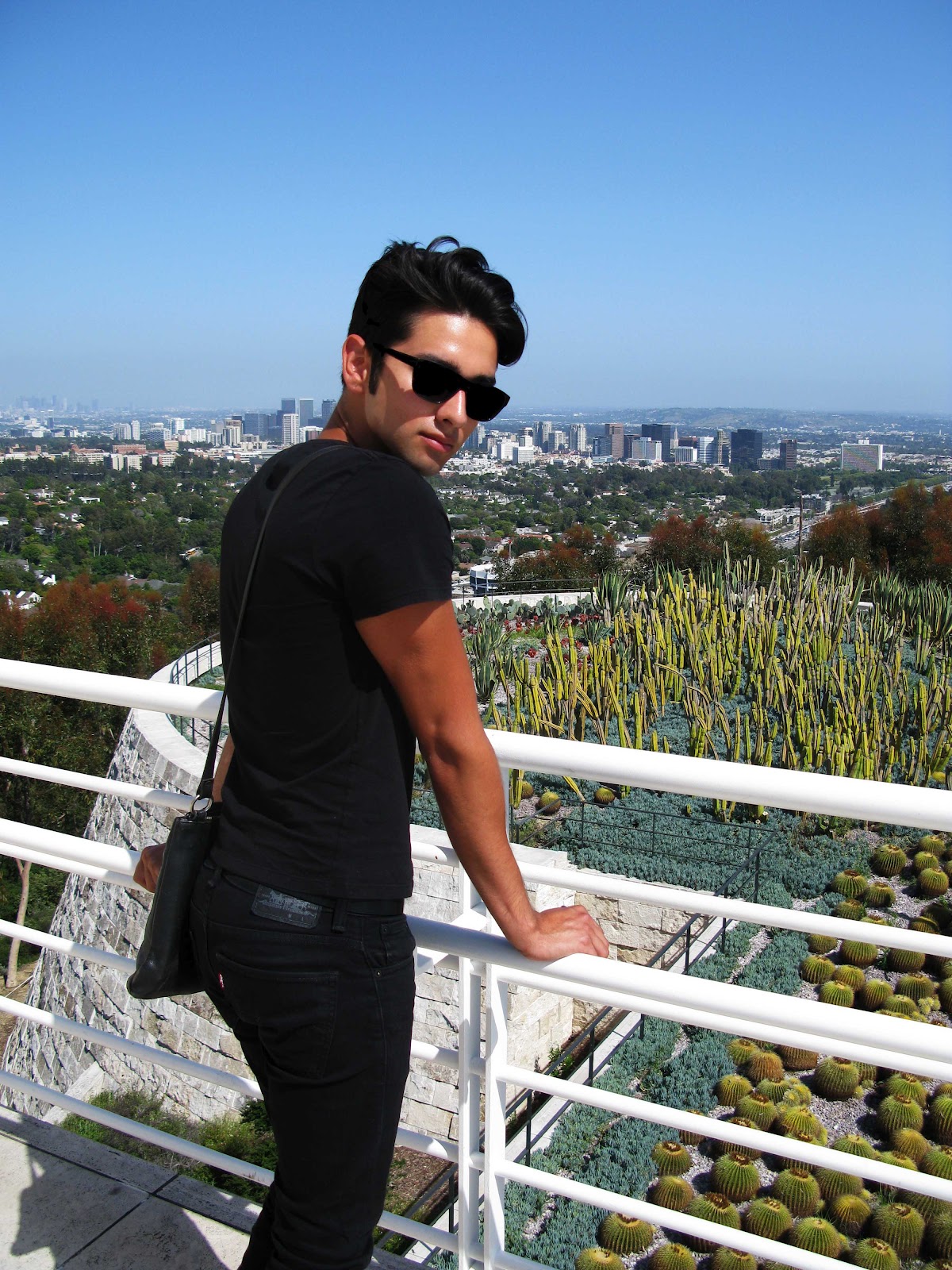
My date, Michael James, embodying the true spirit of L.A. Style at the Getty Museum, LA, 2012.

The exhibit L.A. Style is on view at the Getty Museum through the end of August 2012.

For more info visit:
The J. Paul Getty Museum, Los Angeles.

Monday, May 14, 2012

"The Total Look"

Image by William Claxton of Peggy Moffitt at The Total Look, MOCA, 2012.
There is a fascinating fashion exhibit currently at the Museum of Contemporary Art, Pacific Design Center location in West Hollywood, chronicling the extraordinary collaboration between the designer, his muse, and her husband (the photographer).

The designer in question is Rudi Gernreich, an LA based designer who revolutionized fashion with his innovative take on knits, his development of the tube dress, and his exploration of swimming garments. He boldly explored such concepts as the topless swim-suit and see-through garments, as well as an explosion of color and graphic paterns.

The Total Look at the MOCA, May 2012.


In Peggy Moffitt, he found both model and muse, with her waif-like figure, heavy false eyelashes and  make-up, and her 'five-point' pixie hair-cut, Moffitt was the it-girl of the 1960's, and willing to help Gernreich push the boundaries with his outre designs. She made national headlines in the mid '60's when she posed in Gernreich's topless bikini, known as the 'monokini'.

The Total Look at the MOCA, May 2012.
 The third member of this 20 year long collaboration was Moffitt's husband, the photographer and artist William Claxton, who carefully preserved all of the bold looks in countless photographs and videos.

Through the end of May 2012, this collaboration is on full view at the MOCA. Dozens of designs are on display, showing the excitement of the moment, and the degree of their collaboration. Original Gernreich pieces are on display next to fashion shoots by Claxton of Moffitt wearing the items back in the day.

The Total Look at the MOCA, May 2012.

It is intriguing to see how thoroughly Gernreich designed his looks, from the garment to the headpiece to the shoes and accessories. Clear vinyl dresses contain only three strategically placed polka-dots, or nude body suits feature what appears to be a knitted bikini on top of it, but is actually a one-piece body-suit. Further, it is a pleasure to see how naturally Moffitt embodies the designs, not only wearing them but living them, complete with enormous silk rose earrings or matching one-inch kitten-heels. And then there is Claxton, who painstakingly documents every look for posterity.

It seems a perfectly harmonious collaboration between designer, model/muse, and photographer. Interestingly, after Gernreich's death in 1985, Moffitt retained legal rights to many of his designs and original designs, and continued to promote his work through books and exhibits, including this one at MOCA. When I asked the museum attendant what ever happened to Ms. Moffitt, I was thrilled to learn that she is alive and well, living right here in West Hollywood, and that she had even stopped by the museum a few days before to see the exhibit.

The concept this exhibit really emphasizes is the importance of creative collaboration. Often when we see a beautiful image of a striking woman in a magazine wearing something amazing, it is easy to forget how many artists were involved in bringing this image into existence. Here, 'The Total Look' shows us at least three key players: the designer, the model/muse, and the photographer.

If you are in the LA area, and want to see the exhibit, you had better hurry, as it ends soon.

The Total Look at the MOCA, May 2012.

The exhibit, "The Total Look: The Creative Collaboration between Rudi Gernreich, Peggy Moffitt and William Claxton" is on view now at the Museum Of Contemporary Arts, Pacific Design Center, in West Hollywood through 20 May 2012.

For more info: http://www.moca.org

Tuesday, January 31, 2012

"Love is like a Butterfly"

Asprey NYC Valentine's 2012 by Alton DuLaney.
With Valentine's Day just around the corner, one of my clients requested that I 'romance' their window display, adding something seasonally appropriate without changing out the entire window set. I shopped all of NYC looking for the right element to add a touch of class, whimsy, and poetry, deciding in the end to work with an existing theme I had included in the original window design - the Butterfly. For as Dolly Parton said in a famous song, "Love is like a Butterfly".
Asprey NYC Valentine's 2012 by Alton DuLaney.

One of the products, a vida poche in bone china, has a beautiful butterfly print on it, as does the ad campaign which supports it. This became my inspiration, adding 3-dimentional butterflies which seem to fly off the graphic and out into physical existence.

Asprey NYC Valentine's 2012 by Alton DuLaney.
I carried the butterfly theme, and the color red, throughout all the windows, adding pieces with rubies and pink diamonds to the jewelry windows, as well as sterling silver hearts, and a delicate red butterfly perched on the edge of the display.

Asprey NYC Valentine's 2012 by Alton DuLaney.
All product are featured in red, when available, like this red enamel cocktail shaker. Then, the display is accented with the thematic butterfly.

Asprey NYC Valentine's 2012 by Alton DuLaney.
The leather window, originally featuring business and travel products, is refreshed with a selection of red leather products including an alligator handbag. And although not exactly visible in this photo, a strategically placed butterfly adds continuity to the window.

Asprey NYC Valentine's 2012 by Alton DuLaney.
Overall the window is a beautiful yet subtle statement, to dear Saint Valentine. "As soft and gentle as a sigh", and yet visually impactful.  The striking red of the featured element, catches the eye, and then delights the viewer with its playfulness. 

Maximum effect from minimum input.

A major spring window is currently in the works, which I will share here in late March or early April. Until then, Happy Valentine's Day!

Wednesday, December 7, 2011

"Cash Wrap"

Cash Wrap by Alton DuLaney 2011.
Gift wrap season is here and I have some great ideas to really put the present in presentation, starting with my new signature-deluxe-custom wrap, The Cash Wrap.

Now, everyone loves cold hard cash, and gift wrap can be expensive, so why not multi-task while creating a little added value to the next gift you wrap.

This is a great idea when wrapping a gift-card. It adds humor to the generic item, and for a few extra bucks you can really up the ante on your next gift wrap.

The supplies for this project are simple really, a stack of crisp dollar bills ( or $2 or $5 or $10 or $100 depending on who you are and who you are wrapping for!), some tape, and ribbon and bow for the finishing touch.

Cash Wrap by Alton DuLaney 2011.
You can request crisp new bills from your bank, which will make this project easier and create a neater finished product. I started this with a $1 with an "A" on it. "A" for Alton. See, this is fun already!

Cash Wrap by Alton DuLaney 2011.
Next, line up two of the $1 bills and put a small piece of tape in the center. I use Scotch Pop Up Tape because the pieces are pre-cut and pre-messured which makes the task go a little quicker, plus I think the dispenser is cute, and I get to wear it on my wrist.

Cash Wrap by Alton DuLaney 2011.
When you have two sets of two bills taped together, line those up and tape in the center. Just like saving money, one dollar becomes two, two becomes four, and soon you are rich beyond your wildest dreams!

Cash Wrap by Alton DuLaney 2011.
Or at least your recipient will be! Actually, what you end up with is a custom made piece of gift wrap that looks like it came from the US Mint. (I hope no one sees this and thinks I am counterfeiting money!) Be sure to tape all the edges where the notes meet, to avoid any loose ends.

To ensure that you use just the right amount of bills, lay your package in the center and fold all the way around. Also check the ends to make sure you have adequate coverage. You want just enough to cover the gift without having to trim.

Cash Wrap by Alton DuLaney 2011.
Then wrap you gift per usual, taping down any corners that try to pop up, and add a ribbon and bow for a beautifully finished package.

This gift took 24 one-dollar bills to wrap, adding $24 of value to the gift. After it is unwrapped (carefully!) the tape can be removed and the money can be enjoyed.

This is definitely an outstanding gift wrap and not one that anyone will say: "Oh, it's so beautiful, I hate to open it."

For more gift-wrapping ideas check out my course on Paper Arts at:
http://www.craftsy.com/class/Paper-Arts/25

Shameless Plug: The Paper Arts makes a great holiday gift for the person on your list that has everything. Give the gift of knowledge and creativity!

Sunday, November 6, 2011

"Maurizio Cattelan" - "ALL" at the Guggenheim Museum NYC

Maurizio Cattelan, Guggenheim, NYC, 2011.
One of the beautiful problems with seeing an exhibit at the Guggenheim Museum in NYC, is that the exquisite architecture by Frank Lloyd Wright always competes with the artwork on display. In the current show by Maurizio Cattelan, finally an artist has used the space to full advantage.

Best known for his provocative work "La Nona Ora" depicting a fallen Pope, struck by a meteorite, this installation consisting of practically his entire oeuvre is no less controversial. While his Pope piece cost a museum director her job in Warsaw, (John Paul was Polish after all - oh the blasphemy!), this complicated installation certainly must have challenged some of the best engineers in Manhattan.

Maurizio Cattelan, Guggenheim, NYC, 2011.
Known famously as an art-world prankster, Cattelan has created a true retrospective in this, his swan song, by suspending 128 of his most famous works from the rotunda of the Guggenheim Museum! (Supposedly, only two pieces are absent here, wherein private collectors declined to participate in the exhibition.) And while this would be a feat on any account, with the work of most artists, here it is even more confounded as Cattelan's work consists of some rather large and heavy looking sculpture.

Maurizio Cattelan, Guggenheim, NYC, 2011.
How does one suspend carved marble, huge billboards, major appliances, an oversized skeleton of a cat, and more than a few taxidermied  barn-yard animals to create an awe inspiring mobile of a 20 year career? Vary carefully and strategically, I hope, and I was sure not to lollygag as I passed under the work.
Maurizio Cattelan, Guggenheim, NYC, 2011.
Taken as a body of work, as well as a completely new sculpture considering the intermingling of the works, the installation can only be described as impressive. A giant olive tree with an enormous cube of earth floats threateningly above  meandering viewers in the Guggenheim's atrium below.

For those familiar with Cattelan's work, the Italian born Chelsea resident is known for pushing the boundaries of art. Floating behind the tree is an advertisement from a perfume campaign. For a previous show, Cattelan sold his gallery space to a marketing firm who filled it with a promotional billboard. He has also taped gallery owners to walls and had them pose as his subjects in bizarre costumes. No stranger to scandal, he's been known to brick over the entrance to galleries, and even started his own gallery in NYC called, appropriately WRONG Gallery, which frequently displayed absolutely nothing.

Maurizio Cattelan, Guggenheim, NYC, 2011.
According to legend, an early job in a morgue, stirred his interest in death, and taxidermy is a reoccurring theme. Above, a baby elephant peeks out from under a sheet, which is cute enough, until one recognizes the Klu Klux Klan references.

Maurizio Cattelan, Guggenheim, NYC, 2011.
A child-like Hitler, is perhaps a little more obvious, but still tongue-in-cheek. Is his figure asking for forgiveness or is the artist merely having some fun at the art-world's expense?
Maurizio Cattelan, Guggenheim, NYC, 2011.
Apparently nothing, or no one is sacred. Picasso appears repeatedly, always with an inflated head. Above, he peers from behind a dinasaur-sized skeleton of a cat, something one might expect to see at the Natural History Museum, from the canvas of a Lichenstein, combing countless eras of art history into one jumbled narrative.

Maurizio Cattelan, Guggenheim, NYC, 2011.
And yet, somehow it all makes perfect sense. Out of the cacophony of the modern art milieu, comes a perfectly balanced and orchestrated harmony. Even a life-like old lady in a refrigerator seems at ease, floating near a stuffed donkey or a body bag carved from carrera marble.

Maurizio Cattelan, Guggenheim, NYC, 2011.
Cattelan, himself, appears in many of the pieces, be it as a wax dummy, a tiny portrait, or in taking another jab at the world in which he has enjoyed sizable success, (seen above,) on his back with hands and feet in the air, tongue wagging, an obsequious 'dog' willing to please the establishment, while mocking it.

The artist claims that this will be his last show, that he is retiring from the art work. And as such, his collection of works do look as though they are ready to be shipped off to anxiously awaiting museums and collectors, frantic to own what is now very limited edition. Though judging from the critical acclaim this Guggenheim show is receiving, it is hard to imagine that at only 51, (young in the art world,) that we have heard the last from this artist.

Maurizio Cattelan, Guggenheim, NYC, 2011.
Starring at the blank walls of the Guggenheim - all of the walls were left bare, with the entire focus of the show being the suspended installation - brings to mind several of his other gallery shows, including the one where he simply locked the door to an empty gallery and posted a sign on reading "Torno Subito" or "Be Back Soon" (this piece is included here as well, dangling from the rafters).  I, for one, am hoping that indeed Cattelan will be back soon, and this is not "All" as the title threatens.

Alton DuLaney, Maruisio Catellan Show, Guggenheim, NYC, 2011.
The exhibit runs through January 22, 2012, at the Guggenheim, 5th Avenue at 89th Street, NYC.
http://www.guggenheim.org/new-york/exhibitions/on-view/maurizio-cattelan-all